When to use an underbase in screen printing
Welcome To Cora’s Corner, where every month I am going to help you with your artwork issues. However this month I’m including production issues.
This month I’m going to discuss; When to use a white under base in screen printing?
When estimating the number of screens needed to produce a custom screen print order, designers and clients alike are often unsure whether or not their design will need a white under base. The print colors in the design plays a part, but generally it’s the shirt color that determines whether or not an under base is needed. The look of the design also determines what color under base to use. More on that a little later.
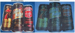
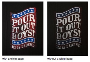
Dark Garments need an under base. By “dark” screen printers mean any shirt that is a color or vibrant. This includes, but is not limited to, black, navy, purple, red, royal, green, yellow, gold, charcoal, any neon – basically any color that would not be considered pastel. If your shirt color is anything other than white or a pastel, you will most likely need an under base.
White, cream, baby blue, baby pink and any very light pastel colors. There are more colors that usually don’t need a white under base (like sand and yellow haze), but if you’re estimating on your own, it’s best to include an under base.
Some inks have enough opacity to achieve a soft-hand print or vintage look by printing with little or no under base. You can leave the under base off when using these opaque ink colors, if you are going for a muted or washed out look. However, certain (transparent) inks simply won’t show up on a dark shirt. In this case, leaving off the under base is not an option even if you are going for a soft hand print. If you desire a super soft print or vintage look, discuss your options with a screen print expert because it is better to engineer the image than to make the ink do all the work.
White is not the only color used for under base. If you want the ink to be bright and closest to it’s true color than use white. However if you are looking for subtle tones, use a cream color to warm the design or a cool gray to give it some cool under tones. Some screen printers have had great success using a clear under base. It all depends what look you are striving to achieve. Let your artist know what elements are necessary and what the “feel” of the look you want to achieve and let them work their magic. Just remember it adds another color/screen to the process. You will get a spectacular print if it is done correctly. Have fun and good luck.
Here are a couple of good examples (you can click on image for a larger view)
I would also like to hear from you about your most pressing issues about artwork. Your question may be used in a future issue of this newsletter. If you have questions, please email me at cora.kromer@qdigitizing.com. And please reference this newsletter.
Looking forward to sharing an exciting journey of discovery into the world of Art.
Sincerely,
Cora Kromer

