Manual Halftones vs Automatic Halftones
Welcome To Cora’s Corner, where every month I am going to help you with your artwork issues. This month I would like to discuss what are manual halftones and what are automatic halftones.
The simplified answer about the difference between the two is, Manual halftones are created in the design before output and Automatic halftones use RIP software to create halftones during output.
What are Halftones?
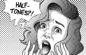
Halftone is the reprographic technique that simulates continuous tone imagery through the use of dots, varying either in size or in spacing, thus generating a gradient like effect. Halftoning is commonly used for printing color photo realistic pictures, blending colors, shading or tints.
Why create manual halftones?
One reason to create manual halftones is to be able to create blends and shading in the design and not use RIP software to do it. Another reason is to use them as design elements in your design. I discuss using them for design elements back in March 2017 blog. Check it out in the archives if you missed it. This blog is about creating them to accomplish screen printing blends and shading. Most graphic software has tools to help you create halftones. There are also 3rd party plug-ins like Astute Graphics Phantasm v3. You will have to do some homework on what setting to use in these tools to match the look you want in your printing.
Creating halftones with a bitmap:
Here’s how to make halftones using Adobe Photoshop:
1. Open your artwork in Photoshop.
2. Go to Images > Mode > Grayscale.
3. A dialog box will pop up saying, “Changing modes can affect the appearance of layers. Flatten image before mode change?” click Flatten.
4. Another dialog will pop up saying, “Discard color information? To control the conversion, use Image > Adjustments > Black & White,” click Discard.
5. Then go to Image > Mode > Bitmap. The Bitmap dialog box will pop up, we left our Output at 300 pixels/inch and Method Use at Halftone Screen, then click OK.
6. That will make the Halftone Screen dialog box pop up. We also left our Frequency at 45 lines/inch, angle at 22.5 degrees and shape at Ellipse. Then click OK.
Now you have your halftones, although these tend to look like little star bursts. They look ugly but tend to print better than they look. I prefer to make my manual halftones in Illustrator using vectored dots.
Here’s how to make halftones using Adobe Illustrator:
1) Select object you need to convert to halftones
2) Object -> Rasterize -> Grayscale, 300dpi
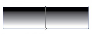
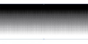
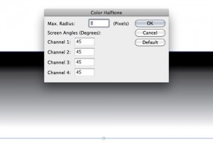
3)Effect -> Pixelate -> Color Halftone -> find the settings that give you the desired effect. For this example, Here, I am using Max Radius 8 and set all the channels to 45 degrees. Experiment with Max. Radius and angles to get the settings that work for you. Now you have a raster halftone gradient, but I still need to vectorize this.
4) Object -> Image Trace -> Make, find the settings that give you the desired effect. Here are the setting I used in image below.
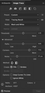
5) Object -> Image Trace -> Expand. Now you have a vector black and white halftone Gradient
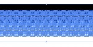
Now you have vectored Halftones.
Automatic Halftones
To create automatic halftones you will have to use RIP (Raster Image Processor) software. RIPs allow non-PostScript Level devices (inkjet printers like Epson) to output PostScript files professionally. A RIP processes: Spot Colors, Simulated Process (Spot Process), 4-Color Process, solid shapes, blends/tints (halftones). You can assign a spot color to the object and the RIP reads each other and puts the object on different sheets of film according to color assigned to it. Other wise you have to create every thing as one color ( c m y or k) on separate layers, then output each layer separately. The RIP software will save you a lot of time and definitely worth the money.
Once you tell it what lpi (lines per inch), dpi (dots per inch), dot shape and angle, it figures out your halftones for you.
Have a great Summer.
Until next month.
Cora Kromer
cora@qdigitizing.com
